UI/UX Design
Improving the login process and account information page in the BSI Mobile application
The goal of this project was to redesign an existing e-commerce website to improve user experience, increase conversion rates, and modernize the visual design.

1. Overview & Background
The goal of this project was to redesign an existing e-commerce website to improve user experience, increase conversion rates, and modernize the visual design.
The Problem:
Convoluted Login Process: The login flow in BSI Mobile feels different and significantly longer than industry standards.
Hidden Account Information: To simply check a balance or view transaction history, users must navigate through multiple inefficient steps. There is no instant visibility.
Research Objectives:
This research was conducted to understand user perceptions regarding:
User behavior during the login process.
User behavior when checking account information.
The difficulties (pain points) users face during these two specific tasks.
2. Methodology 🔍
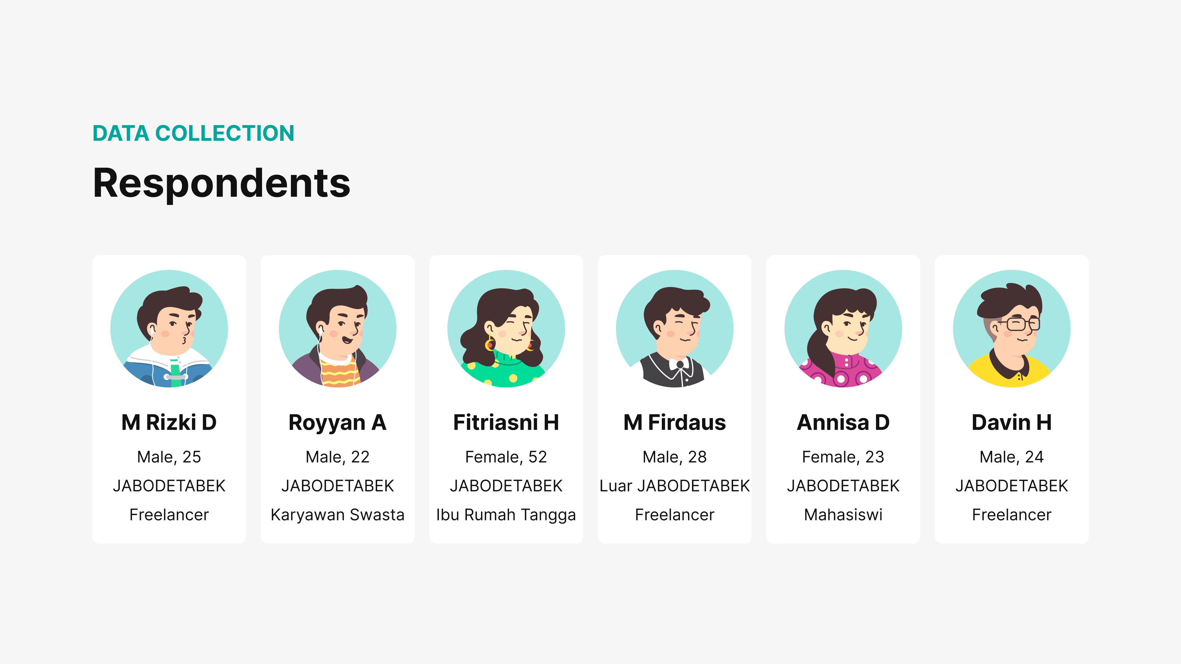
To ensure valid data rather than relying on assumptions, I used a mixed-methods approach:
Primary Research:
Screening Survey (Quantitative): Filtered for respondents matching specific criteria (BSI customers, active users in the last 6 months, aged 18–65).
In-Depth Interviews (Qualitative): Gathered deep insights from 5 selected participants (including a Freelancer, Private Sector Employee, Housewife, and Student).
Secondary Research:
Competitor Analysis: Compared BSI Mobile with competitors (such as Livin’ by Mandiri and Bank Jago) to benchmark industry standards for login flows and balance access.
3. Research Findings & Pain Points 💡
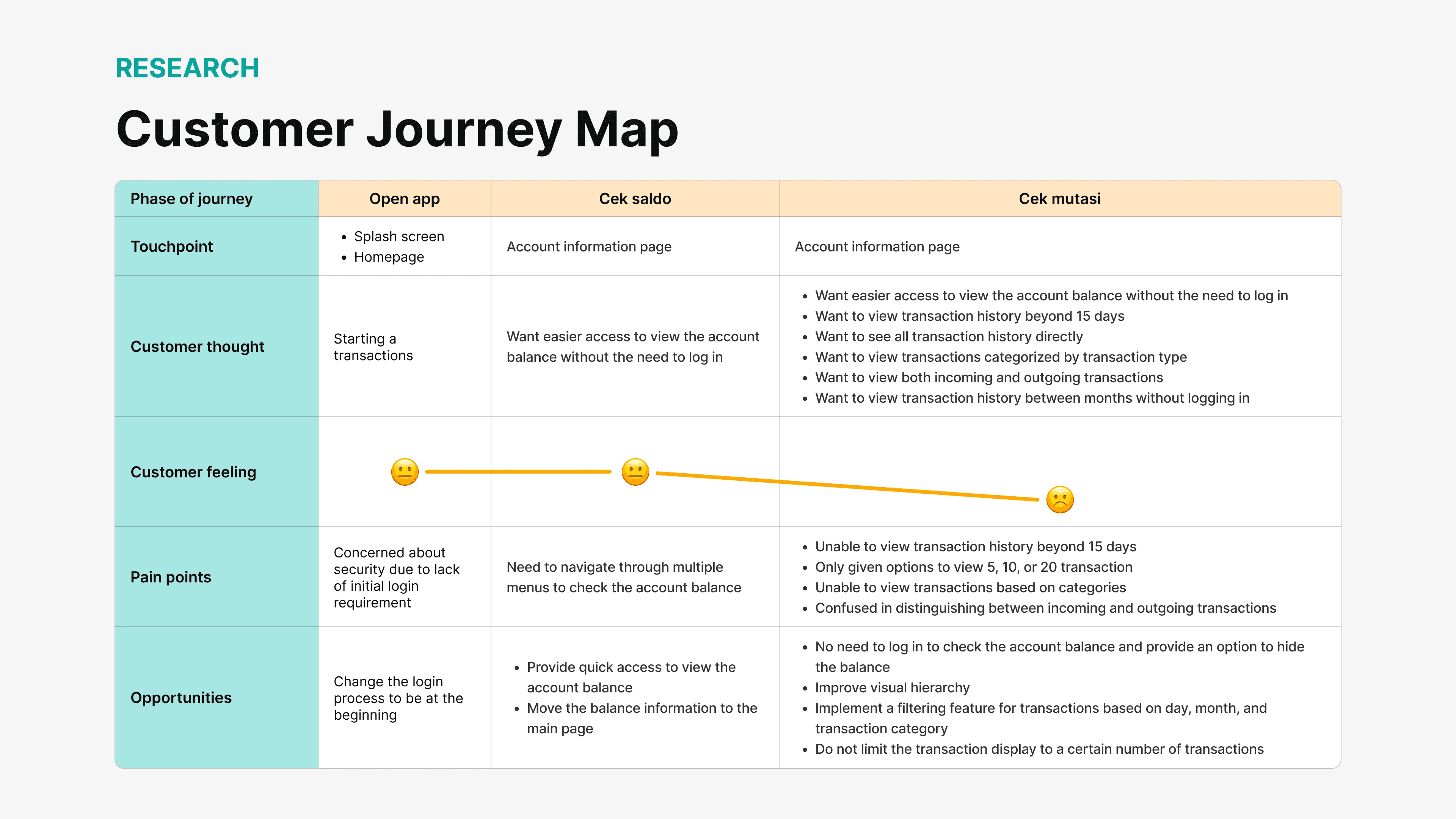
From the in-depth interviews, I mapped out User Personas (e.g., Andi, 24, Freelancer) and a Customer Journey Map. Here are the key findings:
User Motivations:
The need to check balances and transaction history quickly.
Many users are "migrated" customers (from ex-BRI Syariah, Mandiri Syariah, BNI Syariah) or payroll users who are mandated to use the app.
Pain Points:
Lengthy Login Flow: The process is repetitive, requiring users to input passwords/PINs multiple times just to access basic features.
Less Informative Transaction List: The visual hierarchy on the transaction page is poor. It is difficult to distinguish between incoming (credit) and outgoing (debit) funds.
Limited History: Transaction history is restricted to only 15 days or a specific number of transactions (last 5, 10, or 20). Users want to view a full monthly history.
Lack of Filters: There is no feature to filter specific transactions (e.g., filtering only for transfers or payments).
4. Ideation & Solution
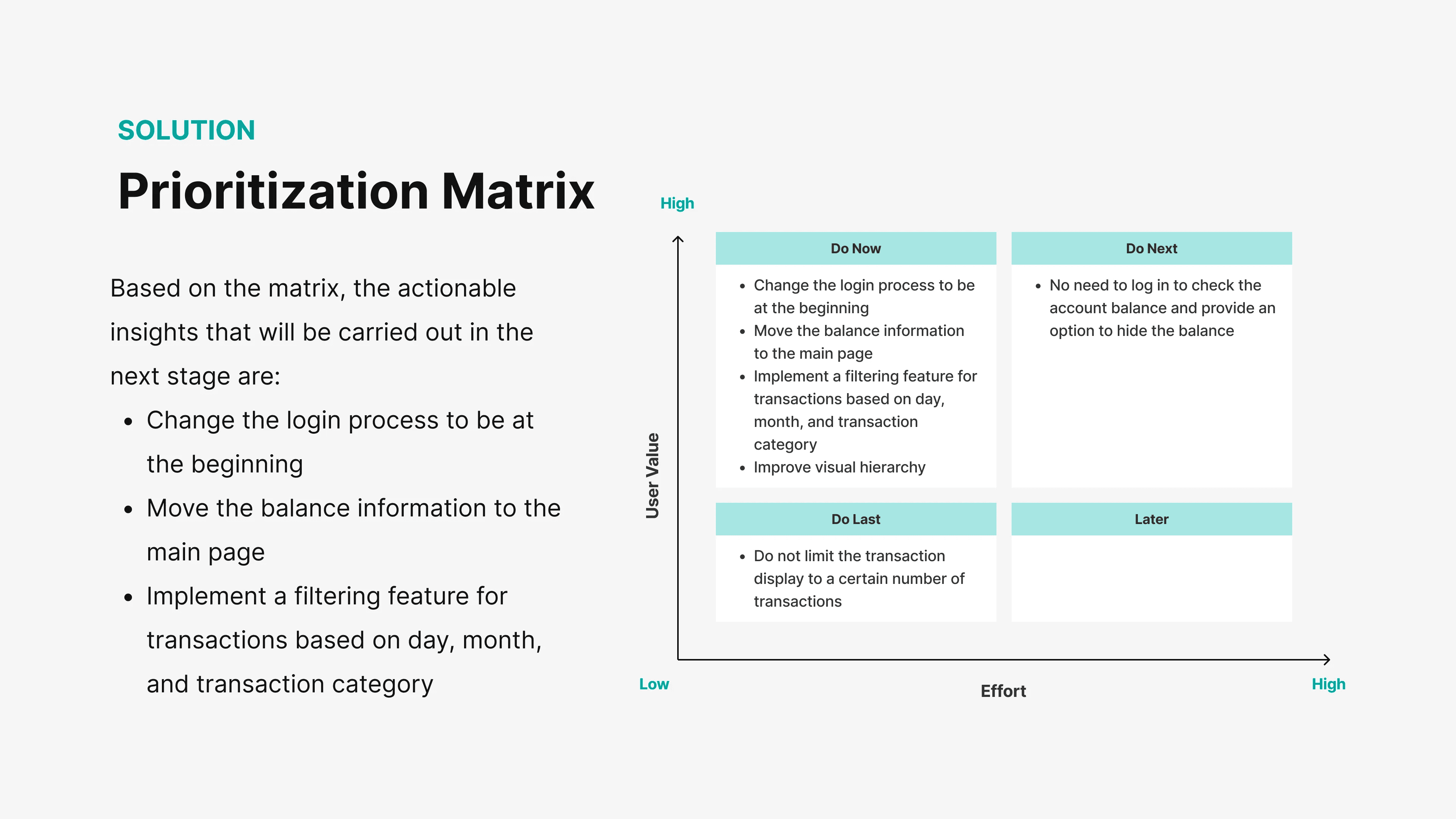
Based on a Prioritization Matrix, I decided to focus on high-impact improvements with measurable effort:
Key Solutions (Do Now):
Relocate Login: Moved the login process to the start of the app (adhering to industry standards) for better security perception and familiarity.
Homepage Balance Info: Displaying the balance and account number directly on the Homepage immediately after login.
Quick Balance Access: A feature to check balances without logging in from the splash screen.
Filters & Visualization: Improving the transaction history layout and adding filter features (by date and category).
Design System:

I built a simple Design System to maintain consistency:
Colors: Primary Teal (#00A39D) and Secondary Gold/Orange (#F8AD3C) to convey a modern yet trusted Islamic banking identity.
Typography: Established a clear hierarchy with Heading (L, M, S) and Body text to ensure readability of financial figures.
5. The Redesign 📱
Here is the Before-and-After comparison of the solutions I implemented:
A. Login & Quick Balance (Splash Screen)
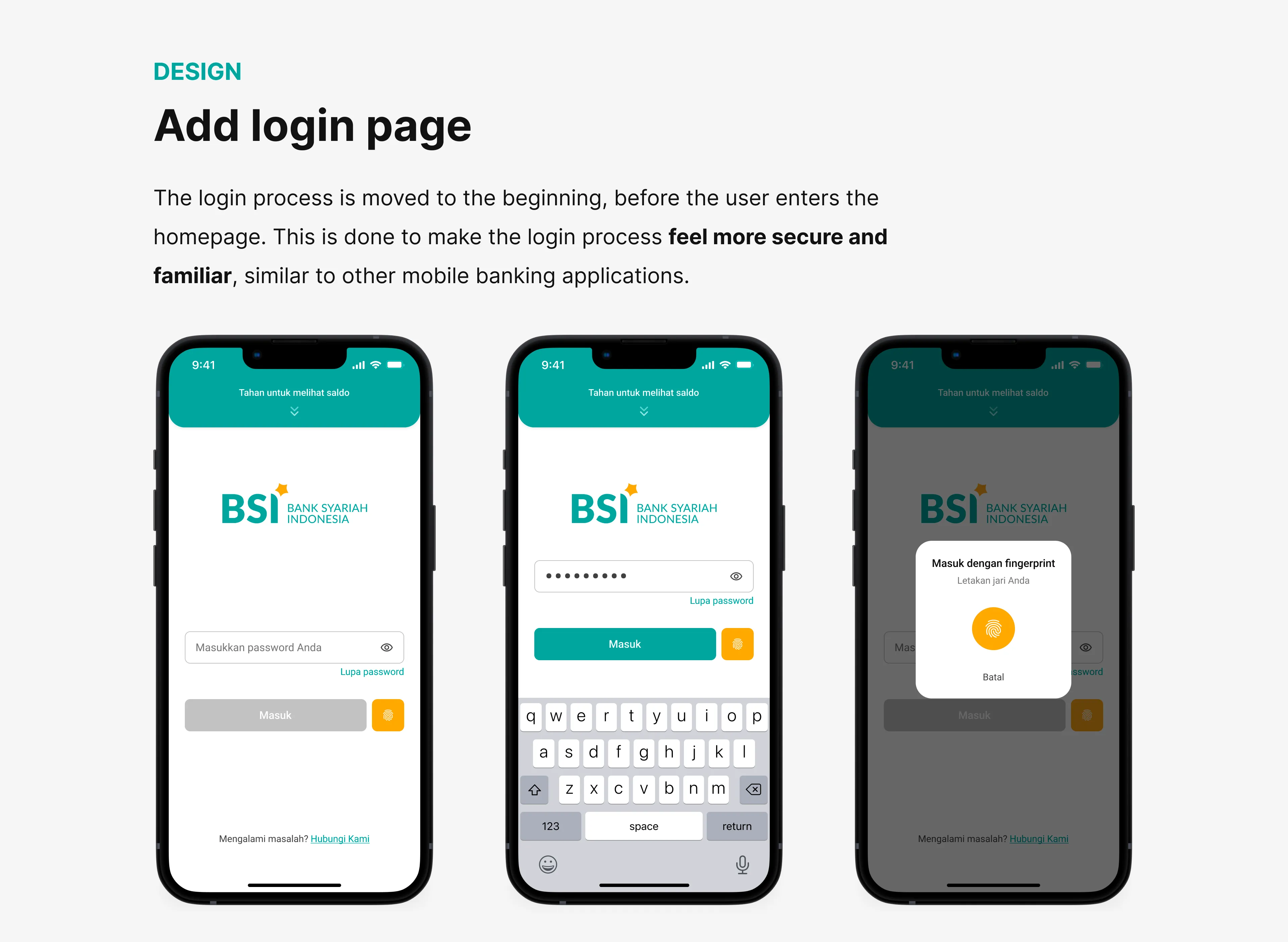
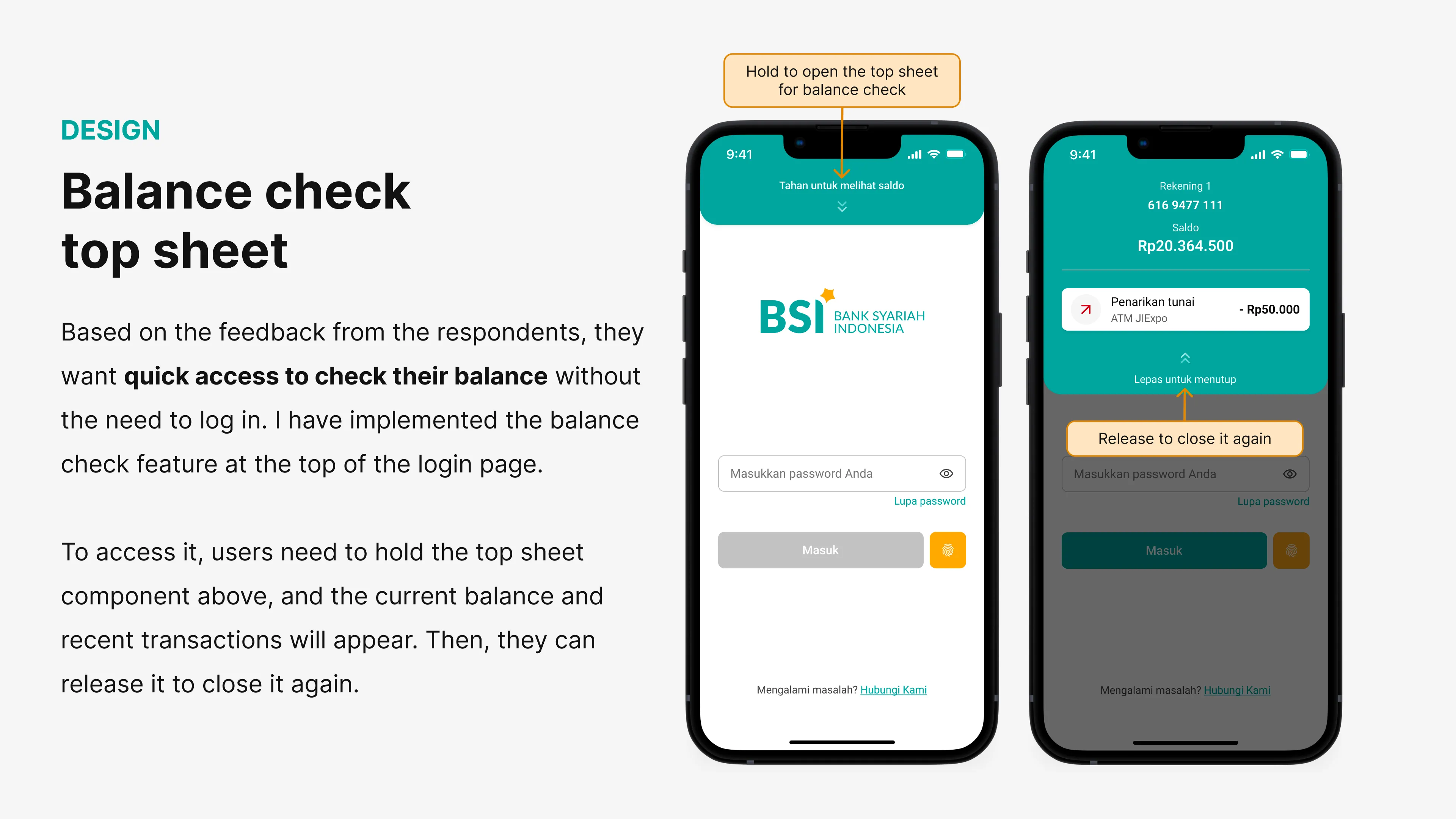
Before: Users had to enter a menu first, then log in only when clicking a specific feature.
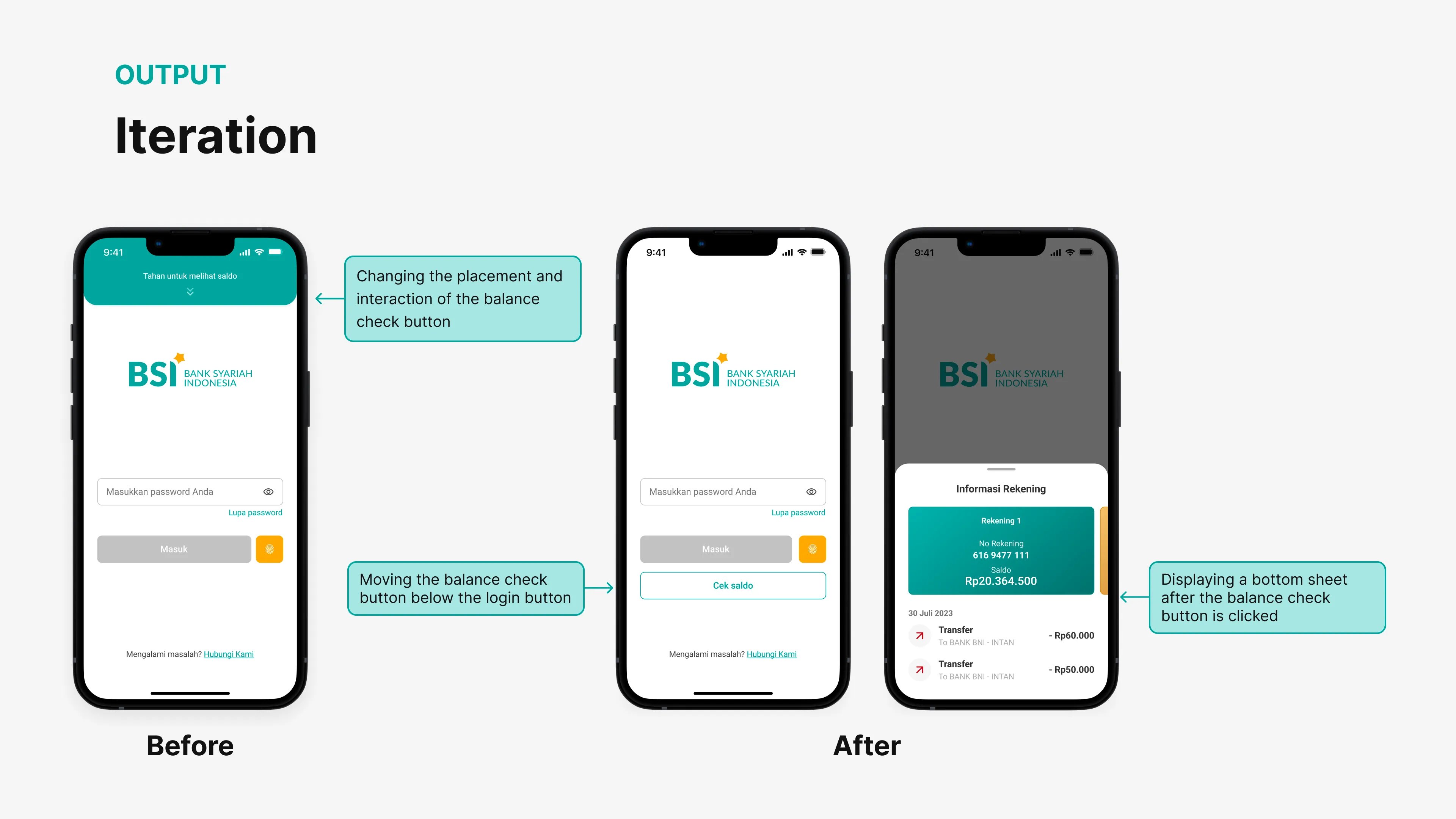
After: Login is now upfront. I added a "Hold to view balance" feature on the login page. This allows users to peek at their balance without fully entering the app.
Iteration: Initially designed as a "hold" gesture, testing revealed users preferred a simple tap to open a bottom sheet.
B. Homepage
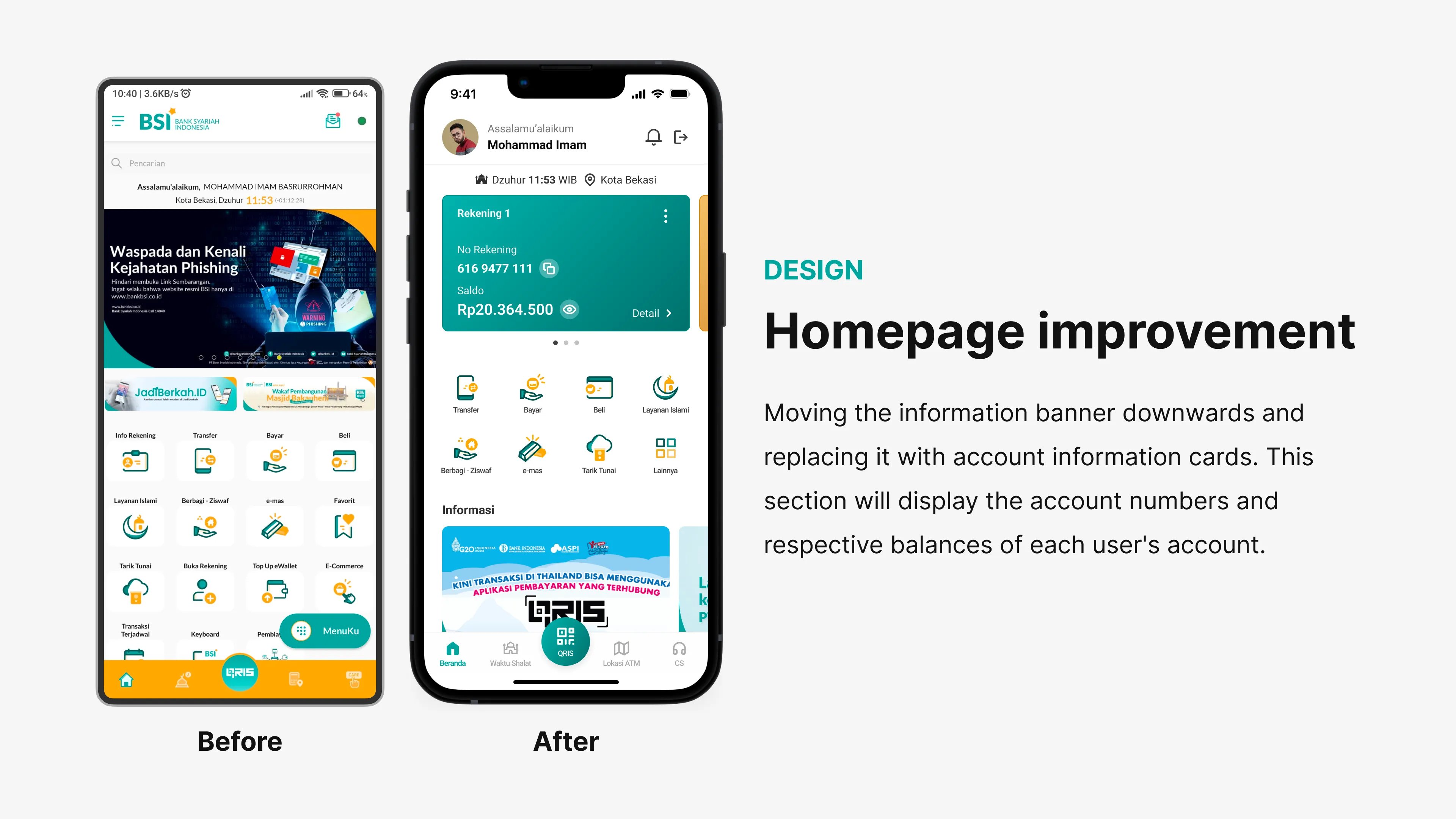
Before: Promotional banners dominated the screen; account info was hidden.
After: The Account Information Card is now the main focus at the top. Users instantly see their Account Number and Active Balance.
C. Mutation Page (Account Information)
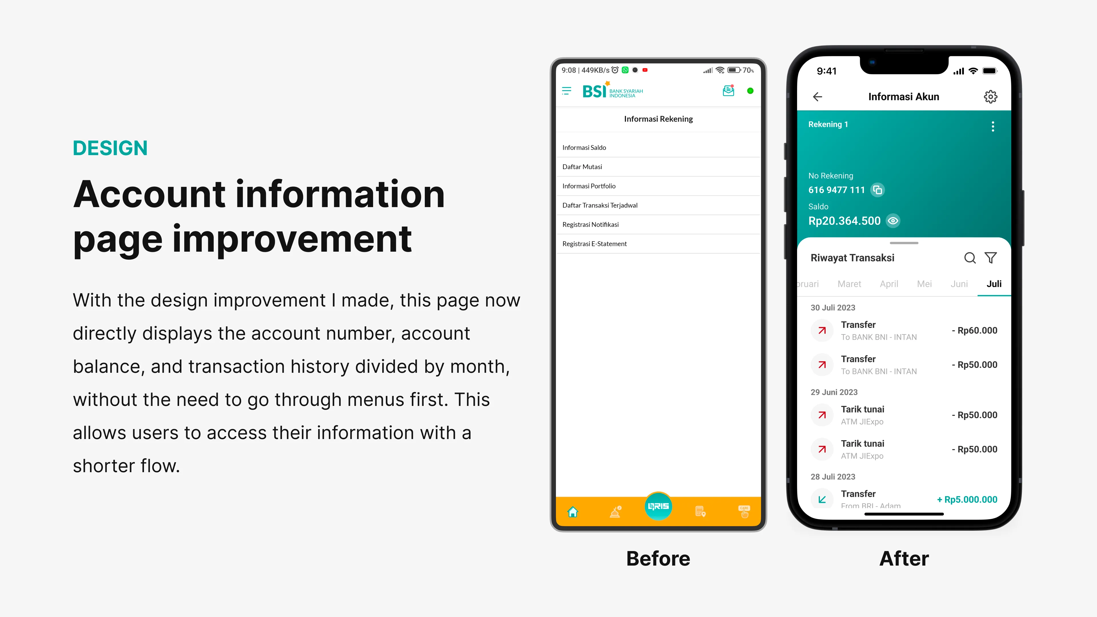
Before: Users had to click "Account Info" > "Transaction List" > Select a narrow date range.
After: Transaction history appears immediately below the balance info.
New Feature: Added a Filter button. Users can now filter transactions by Category (Transfer, Payment, Purchase, E-wallet) and flexible Date Ranges.
6. Usability Testing & Validation 🧪
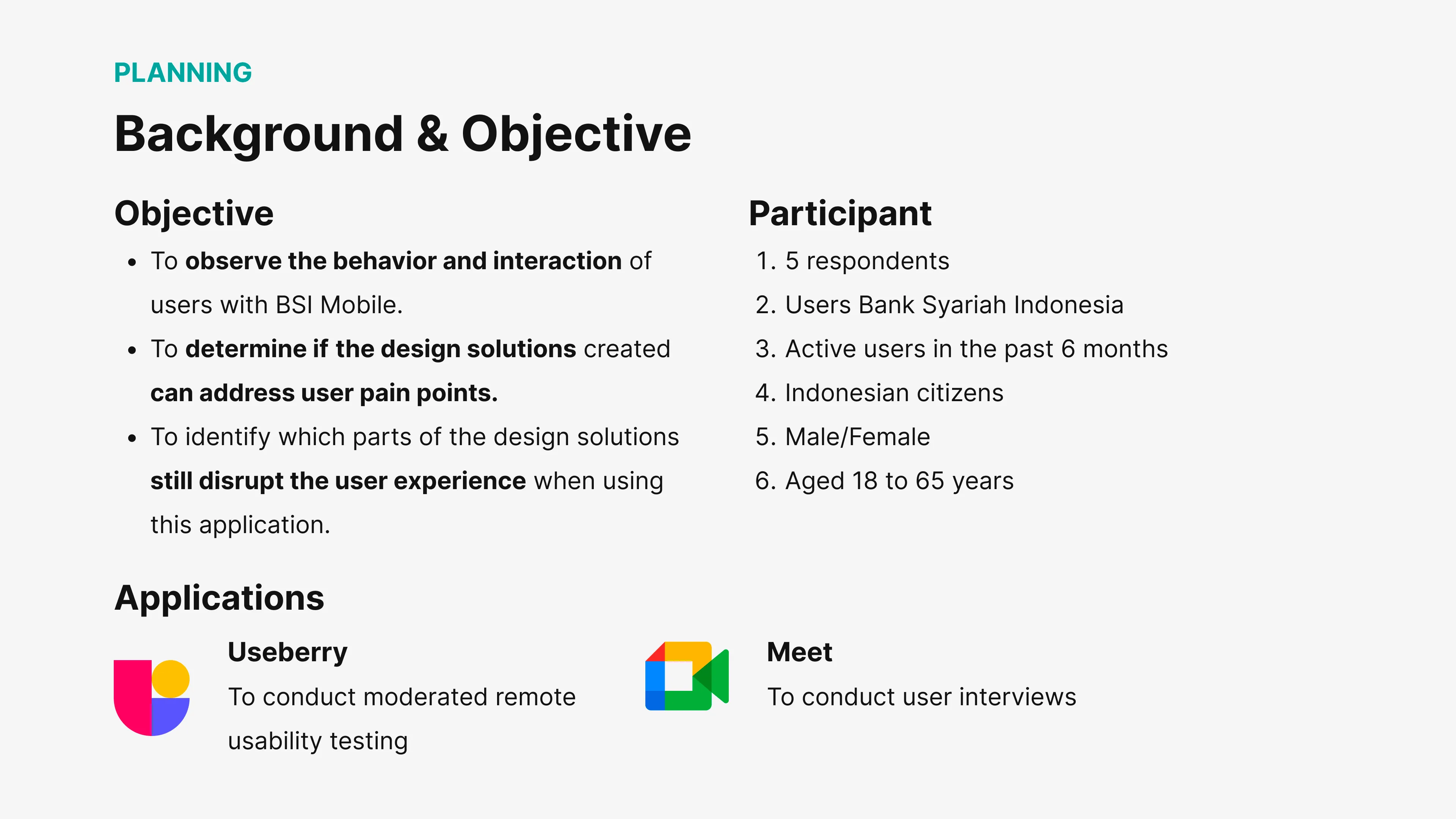
I conducted testing using Useberry with 5 respondents on specific task scenarios.
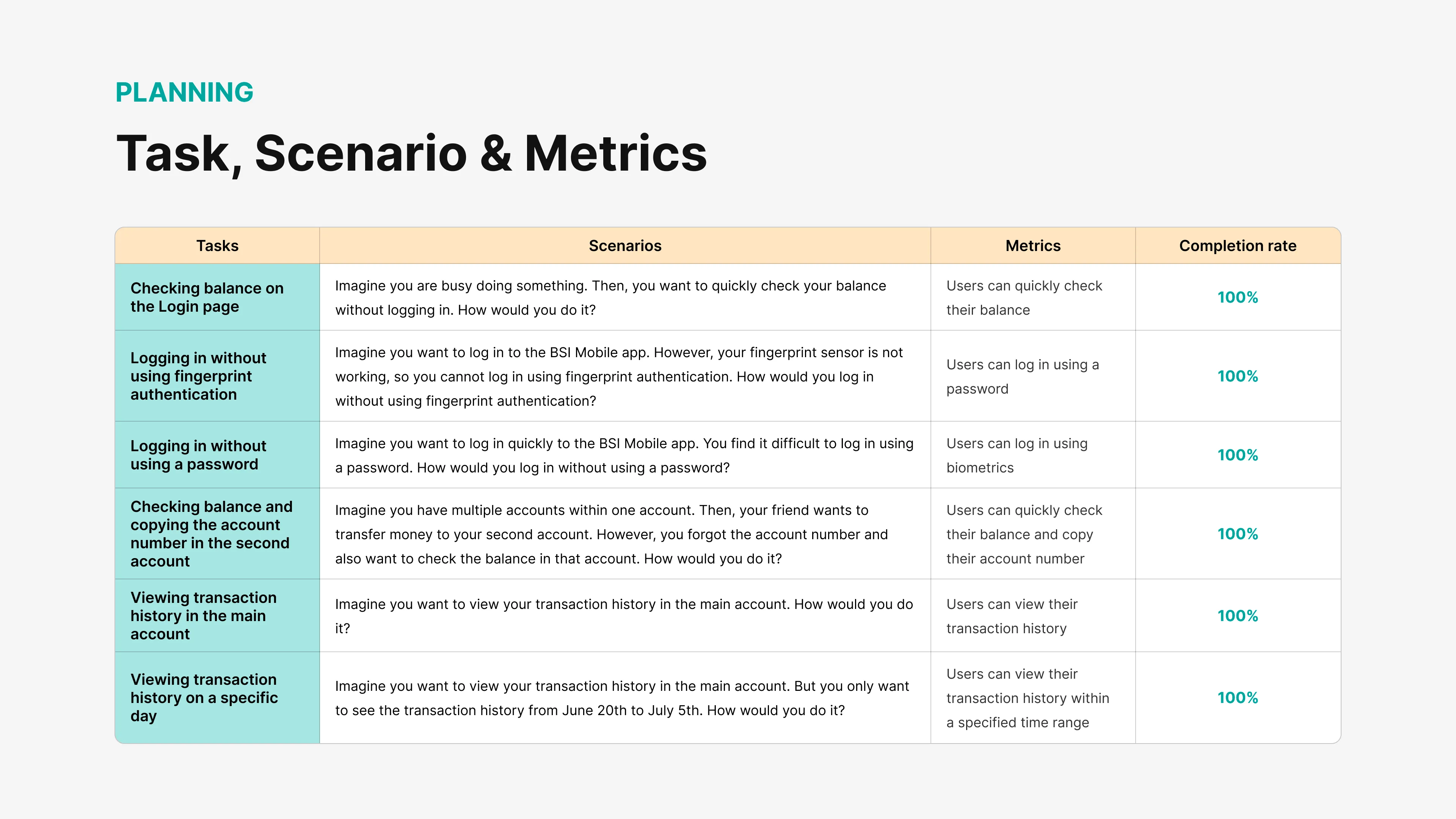
Metric Results (Success Rate & Time):
Check Balance on Login Page: 100% Success (Avg. time 31.3s). Users felt this feature significantly sped up the process.
Login Without Password (Biometric): 100% Success (Avg. time 9.7s). Extremely fast and convenient.
Check Main Transaction History: 100% Success (Avg. time 10.7s). Users immediately understood that the "Details" button opened the full history.
Filter Transactions (Specific Date): 100% Success (Avg. time 55.4s). Although successful, there was slight confusion with the calendar date selection, which I subsequently refined.
Key Iteration from Testing:
A major insight came from the Login Balance Check feature. I initially designed it with a "Hold" interaction. However, some users found it physically tiresome or didn't realize they needed to hold.
Fix: I changed the interaction to a "Check Balance" button that opens a bottom sheet when clicked. This is more accessible and reduces cognitive/physical load.
7. Conclusion & Learnings 🎓
This redesign process taught me that a designer's assumptions do not always align with user needs.
Research proved that BSI users crave time efficiency (reducing clicks).
Simple features like "Transaction Filters" and "Quick Balance" had a much higher impact on user satisfaction than mere visual (UI) updates.
Thank you for reading this case study!
Connect with me:
📧 Email: basrurrohman@gmail.com
💼 LinkedIn: Mohammad Imam Basrurrohman